

UX Design Case Study
My Way
An innovative mobile application designed to provide step-by-step guidance and real-time navigation, helping infrequent travelers navigate airports with ease—whether for transit, boarding, or arrival—ensuring a stress-free overall airport experience.

Project Summary
The Problem
Travelers often feel overwhelmed and anxious at unfamiliar airports due to complex layouts and time constraints.
The Solution
A mobile app offering a suite of features, including real-time navigation with step-by-step guidance, estimated travel times between terminals, a dual-mode interface for exploration or emergency needs, and personalized recommendations for restaurants, shops, and airport amenities. The app ensures a seamless and stress-free airport experience by addressing urgent needs (e.g., finding a smoking zone) and providing leisure options for downtime.
The Context
UX design project for my UXD Master's degree, course name Fundamentals of User Experience.
The Team
Cici Dong, Emma Luo, Kristin Xie, Iris Liang
My Role
-
I conducted two user interviews to identify common challenges travelers face in airports.
-
I contributed to the research and development of key deliverables: Background Research, Stakeholder Analysis, User Profiles, User Personas, As-Is User Journey Map, To-Be User Journey Map.
-
I facilitated usability testing sessions with two guest experts and documented insights into group reports.
-
During Ideation and Prioritization phases, I provided strategic input to define the team's design direction and edit the work, focusing on refining the clarity and effectiveness of key messages.
-
As a lead for preparation of group report presentation, I helped the teams organize key information for clarity and presented three times for feedback.
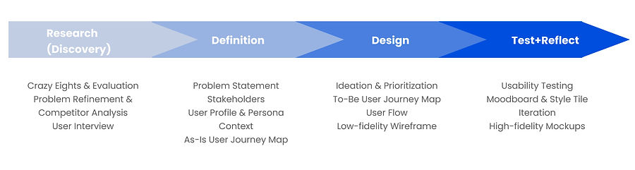
Overview of Project Stages
This project focused on user-centered design aiming to develop an indoor navigation tool to improve travelers' experience in the airport. The sequential stages of the project, from initial research and discovery to defining user needs, designing solutions, and refining the app through iterative testing and reflection.
_edited.jpg)
Project Stages
Phase One: Research (Discovery)
The research phase focused on understanding the existing challenges and needs of airport travelers through a mix of creative ideation and user research, as a team we did:
-
Crazy Eights: Brainstormed multiple potential ideas in a limited time frame, aiming to gather quick ideas for project inspiration and further generate problem statements.
-
Problem Refinement: Reviewed the initial problem statement and adjusted it based on team discussions and emerging insights.
-
Background Research and Competitor Analysis: Analyzed the existing problems and existing solutions.
-
User Interviews: Conducted Interviews with eight participants to understand the real common issues they face while in the airports and gained insights into pain points.


Insights from User Interviews
-
Travelers are unclear about procedures before boarding, in transit, or after arriving
-
Lack of instruction on local airport regulations causes anxiety and time wastage
-
Travelers having difficulties interacting with airport
-
Lack of instructions after unexpected situations
My Contribution
-
I took the lead in organizing the group's background research into a cohesive document. I also provided input on identifying key gaps in existing navigation solutions.
-
Out of 8 interviews in total, I conducted two interviews, focusing on understanding participants' pain points and documenting their feedback on existing applications in detail. I synthesized these insights into key themes and organized them into our team documents to inform the next stages of the project.
Phase Two: Definition
The definition phase focused on synthesizing the findings from the research phase to define the project scope and user needs, as a team we created:
-
Problem Statement: Refined again based on the findings from user interviews.
-
Stakeholders: Identified key stakeholders within airport context.
-
User Profile & Persona: Created detailed profiles of the target audience based on prior research and a persona that represented target users.
-
As-Is User Journey Map: Mapped the current journey of an infrequent traveler navigating an unfamiliar airport.

My Contribution
-
I analyzed the key themes from user interviews again and proposed adjustments to the problem statement to emphasize users' needs for real-time navigation and urgent need support.


My Contribution
-
I synthesized findings from the research phase to create key components of the user profile, focusing on their reliance on technology and desire for efficient navigation. I also helped the team to develop a persona by adding clarity to the story context and pain points.

My Contribution
-
I contributed to clarifying what the user is doing and feeling at the moment. I highlighted key moments of stress and confusion, ensuring these were considered in the design of the future solution.
-
I presented our research data and analysis to two UX experts for feedback.
Phase Three: Design
The design phase focused on translating insights and definitions into actionable design solutions, as a team we created:
-
Ideation & Prioritization: Conducted brainstorming sessions to generate potential features that should be included and used prioritization grids to evaluate ideas based on user value and implementation effort, such as time estimation components, navigation map, and task management.
-
To-Be User Journey Map: Expanded on the user journey by detailing how the app would guide the persona through key tasks to improve experience in airport.
-
User Flow: Created a detailed flowchart outlining how users would navigate through the app (The Happy Path).
-
Low-Fidelity Wireframes: Designed basic wireframes to visualize the app's structure and layout. The focused screens emphasize the happy path when interacting with the app.


My Contribution
-
I actively contributed to brainstorming sessions, proposing features like different ways of displaying maps (and finally going with a 2.5D Navigation Map) and how we can possibly include both exploration and need-solving in one application.

My Contribution
-
I contributed to editing key moments in the journey, ensuring that the app addressed both functional needs (navigation) and emotional needs (solving urgent problems to reduce user's anxiety).


My Contribution
-
I participated in developing the flowchart by ensuring that user actions and transitions were intuitive. I reviewed and refined the flow to minimize cognitive load and ensure its ease of use.
-
I created the home page and helped edit exploration options screens using Figma, ensuring that these designs incorporated prioritized features and clear visual representations.
Phase Four: Test and Reflect
The final phase centered on evaluating the app through usability testing, gathering feedback from users, and iterating on the design to address identified issues. This process ensured the app met user needs effectively and communicated its core functionalities clearly, and as a team we did:
-
Usability Testing: Conducted testing sessions with six users and two experts where they interacted with the prototype in scenarios, such as finding a smoking zone.
-
Iteration: Refined the prototype based on user feedback.
-
Moodboard & Style Tile: Developed a visual design system inspired by calming blue tones for showing professionalism, complemented by vibrant colors to evoke energy, positivity, engagement, and intuition. These made sure that the aesthetic is consistent.
-
High-Fidelity Mockups: Designed the polished screens that incorporated the final feedback and showcased the app's core features.


My Contribution
-
I did a group report presentation/usability testing with two UX experts, observed the experts' interaction with our low-fidelity prototype, and noted areas where users struggled or expressed confusion.
Feedback and Changes


My Contribution
-
Based on the feedback from experts, I contributed to revising the home screen (embed an interactable map instead of mode choosing), needs displaying screen (change displaying shapes of the needs), and explore screens (add filters and recommendations for users to browse through).
Mood Board
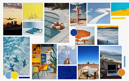
Our group's chosen vision words are:
Vivid
Professional
Intuitive
Engaging
Can fit both serious and fun
Our team's final design consists of dark shade of cyan-blue, light blue, and vibrant yellow for highlights.
Style Tile

My Contribution
-
I made sure that the chosen colors matched the message we were trying to convey - we wanted to express a feeling of professionalism while making it engaging.


My Contribution
-
I collaborated with my teammate to make high-fidelity mockups, ensuring colors are consistent for every screen and the visual hierarchy is clear.
-
I wrote out the whole storyline when users interact with our app, illustrating details about each screen's functions and how they navigate to the next page.
Reflection and Conclusion
This is my first UX design project. It significantly enhanced my understanding of the whole design process and improved my design skills using Figma, making me a more skillful professional. By engaging in iterative testing, I became more confident in how to leverage user feedback to improve designs effectively. Each usability test provided actionable insights, reinforcing the value of continuously refining designs to align with user needs. Conducting both user interviews and usability testing emphasized the importance of empathy and a user-centered approach, teaching me to prioritize the needs and challenges of users over assumptions.
Additionally, leading the group presentation and organizing insights strengthened my ability to synthesize team contributions and present cohesive deliverables—an essential skill for cross-functional collaboration.
Looking ahead, there are several areas I would approach differently in future projects. One area for improvement is dedicating more time to testing visual design elements like color schemes and visual hierarchy with diverse users to ensure the interface is universally intuitive. Additionally, I will try to contribute more, such as involving more during the improvement phase from low-fidelity wireframe to high-fidelity mockups.
This project has equipped me with actionable strategies and a stronger foundation in UX design, emphasizing the importance of a user-centered mindset, collaboration, and continuous iteration.